Commercial Paint and Productivity: 2023 Color Ideas for Your Office
You might not think about it much, but the color of an office, enhanced by the right commercial paint, has a substantial impact. Sure, it affects the office’s appearance greatly. However, it does something more than that; commercial paint colors affect employee productivity.
In other words, some commercial paint colors are better for productivity than others. Wondering what these are? Then keep on reading.
Without further ado, here are 2023’s best commercial office paint color ideas for increased productivity.
Understand What Each Color Brings to the Table
First and foremost, you must gain an understanding of what each commercial paint color brings to the table. Every color evokes different feelings in human beings and can be used to either inspire or turn off a person’s productive instincts. Let’s review some of the most common commercial paint colors below. This should help you decide which colors work best for your office.
Blue
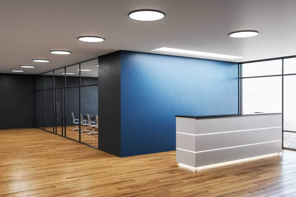
Commercial paint in blue tends to evoke a feeling of energy in human beings. It’s mentally stimulating and therefore tends to result in increased productivity. It doesn’t matter the shade either; whether it’s navy blue, powder blue, or something in between, it will serve your office well.
Yellow
Yellow, when used in commercial paint, tends to be associated with happiness. It’s often found to inspire human beings, and, in some cases, can even bring their emotions to the surface. This makes it a solid option for offices in creative industries.
Red
Red commercial paint has an aggressive feel to it. It’s often used to evoke a feeling of urgency. As such, it’s commonly used in medical centers, fire departments, and the like.
Green
Green is generally regarded as a calming and balanced color. Commercial paint in green evokes positivity, though it doesn’t necessarily bring out a sense of energy. While it’s not quite as neutral as a white or a gray, it’s still, more or less, neutralizing.
Gray
Gray commercial paint is typically thought of as a dreary color. When it’s dark, this is undoubtedly the case. However, light grays can be used in tandem with brighter colors to produce a sense of balance.
White
White commercial paint feels sterile and cold. It’s commonly used in hospitals. Hospitals, of course, are sterile and cold.
In short, commercial paint in white is not the most inspiring color around. So, if your goal is to improve productivity, it’s probably not the best color to go with.
Brown
Brown commercial paint carries a connotation of power and strength. That said, too much brown can feel overwhelming. As such, it’s best paired with other colors, be they white, gray, or even blue.
Purple
Purple has a delicate softness about it. Commercial paint in lighter shades of purple can help to spur productivity, whereas darker shades can overwhelm the mind.
Orange
Orange is typically regarded as an intense color. It is, after all, the color of fire. While commercial paint in orange can inspire an energetic feeling, it can also inspire a feeling of stress, something that’s not typically great for productivity.
Black
Black commercial paint is dark and doomy. It has its place but is not a great option for inspiring productivity.
Off-white
Standard white is not great for inspiring productivity. As such, it should, more or less, be avoided. Off-white, on the other hand, isn’t a bad option. It possesses a calmness and warmth, and pairs terrifically with other inspiring colors.
Keep the Color Scheme Simple
Regardless of what colors you use for your office, you need to be sure to keep the color scheme simple. Not only should you use only a small number of colors, but you should be sure to use them in a basic and straightforward way. In other words, this is no time to do an art project.
Complex paint designs certainly have their place. However, they also tend to overwhelm the human mind. As such, they tend to have a negative effect on productivity in the workplace.
We recommend using no more than two colors in your color scheme. One of these should be a primary color that comprises most of your office’s decor. The other should be an accent color for trim and other small entities.
If you need help choosing appropriate colors for your color scheme, ask your local painting company. They’ve painted countless office interiors and will know exactly how to handle the color selection process.
Consider Your Industry
Our last tip is to consider your industry. Just because one office uses a specific color doesn’t mean that yours should. The nature of your industry should factor into the color that you use.
Let’s say that your office is for a stock trading company. If so, you might want to use red as it will signal urgency.
Your office may be for a financial advising company. If so, green might work well, as it’s the color of money.
Is your office for a tech company? If so, it’s probably best to maintain a laid-back atmosphere. Blue or yellow would work well.
Consider the type of work that your employees are doing and then choose a color that accommodates them. It’s as simple as that.
Looking to Put These Commercial Paint Color Ideas for Office Into Action?
And there they are, the top commercial office paint color ideas to boost productivity. Looking to make one of these ideas a reality? If so, and if you need office painting services in Colorado Springs, we here at Tecc Painting are the ones to see.
We’re well-versed in the process of office painting, having painted countless commercial buildings throughout the Colorado Springs area. Regardless of the color that you’re looking for, we can accommodate you.


